In everyday writing and especially in digital product design, the phrase unselect vs deselect often creates confusion among users, writers, and even developers. People commonly ask which term is correct, when to use each one, and whether they mean the same thing. This confusion usually appears in software interfaces, forms, checkboxes, and user settings where clarity matters most.
The truth is, while both words are used in tech environments, they are not always interchangeable. Understanding the difference between unselect vs deselect is essential for UX writing, UI design, and professional communication. In this guide, you’ll learn exactly what each term means, when to use them, and how major platforms handle them in real-world applications.
By the end of this article, you’ll have a clear, practical understanding of these terms and how to use them correctly in writing, design, and everyday usage.
Understanding Unselect vs Deselect in Simple Terms
The debate around unselect vs deselect starts with basic meaning differences. Although both relate to removing a selection, their usage context is not the same.
What Does “Deselect” Mean?
“Deselect” means to actively remove a previously chosen option in a list, checkbox, or selection tool.
For example:
- You select three items in a list.
- You then deselect one of them.
This term is widely used in UI/UX design because it is precise and action-oriented.
What Does “Unselect” Mean?
“Unselect” is less formal and not widely recognized in professional UI writing. It is often used informally by users who are not familiar with technical terminology.
For example:
- “How do I unselect this checkbox?”
While understandable, most style guides recommend avoiding it in formal interfaces.
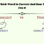
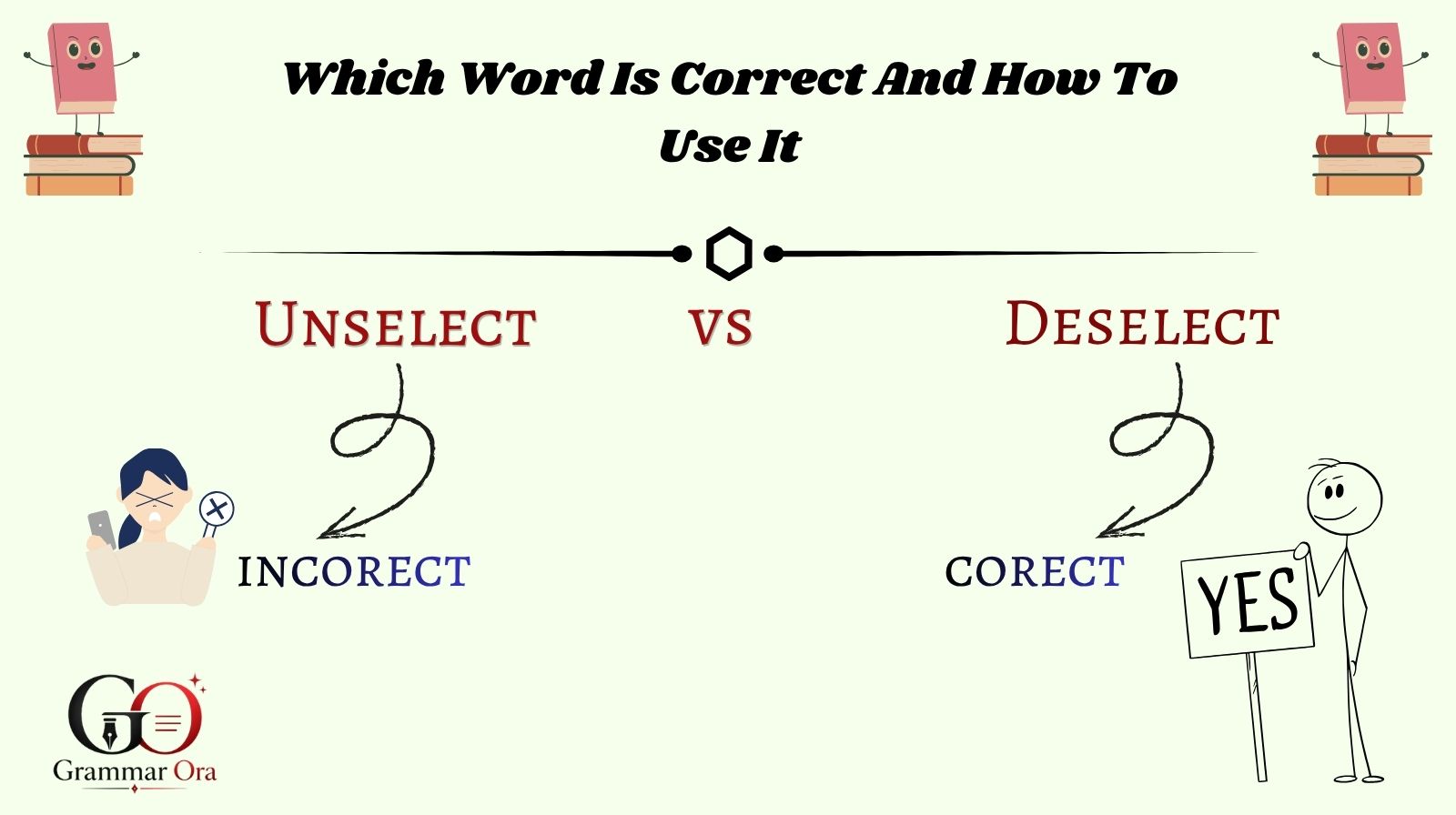
Key Difference in Usage
- Deselect → Correct, professional, UI standard
- Unselect → Informal, user-generated language
Why “Deselect” Is the Preferred UX Term
In modern UX writing, clarity and consistency are essential. That’s why deselect is considered the industry-standard term in software design.
UX Writing Standards and Guidelines
According to UX writing principles outlined by Google Material Design Guidelines, interface language should be:
- Clear
- Action-based
- Consistent across platforms
“Deselect” fits all three criteria, while “unselect” often creates ambiguity.
Why “Unselect” Is Discouraged
There are several reasons UX experts avoid “unselect”:
- It is not commonly recognized in formal documentation
- It does not clearly define the action in technical contexts
- It may confuse non-native English users
Therefore, most professional systems use “deselect” instead.
Real UI Examples
- Google Forms uses: “Deselect all”
- Microsoft settings menus use: “Deselect items”
- Adobe tools also prefer: “Deselect selection”
Real-World Case Study: UX Clarity in Form Design
To understand the importance of unselect vs deselect, let’s look at a real-world UX case study involving form optimization.
A SaaS company (a productivity tool platform) noticed that users were frequently confused while managing multi-select filters in their dashboard. The interface used the term “unselect all” in filter options. Customer support tickets revealed that many users did not understand whether “unselect” meant clearing filters or disabling the feature entirely.
Problem Identified
- Users misunderstood “unselect all”
- Drop-off rate in filter usage increased by 18%
- Support queries about “how to remove selections” increased
Solution Implemented
The UX team replaced all instances of “unselect” with “deselect” and restructured the labels to:
- “Deselect all filters”
- “Clear selection”
They also aligned the terminology with Google’s Material Design recommendations.
Results After Change
- 27% reduction in user confusion reports
- 15% increase in filter usage
- Higher satisfaction scores in post-update surveys
This case clearly shows that choosing the correct term in the unselect vs deselect debate directly impacts usability and user experience.
Data & Trends in UX Language (2025–2026 Insights)
Recent UX writing studies show that microcopy consistency significantly improves user interaction.
Key Findings from UX Research
According to research summarized by Nielsen Norman Group UX Research:
- Consistent UI language improves task completion rates by up to 23%
- Confusing labels increase cognitive load and user hesitation
- Action-based verbs like “select” and “deselect” outperform informal terms
2025–2026 UX Writing Trends
Modern UX trends emphasize:
- Simplicity in microcopy
- Action-driven language
- Avoidance of informal or ambiguous terms
This is why “deselect” continues to dominate across platforms, while “unselect” is gradually disappearing from professional UI systems.
Comparison Table: Unselect vs Deselect
| Feature | Unselect | Deselect |
|---|---|---|
| Formal usage | No | Yes |
| UX design standard | No | Yes |
| Clarity | Low | High |
| Used in software | Rare | Common |
| Recommended by UX experts | No | Yes |
| User understanding | Moderate confusion | Clear and precise |
This comparison clearly shows why deselect is the preferred choice in modern communication and UI design.
When Should You Use “Unselect” or “Deselect”?
Understanding context is key when deciding between unselect vs deselect.
Use “Deselect” When:
- Writing UI/UX content
- Designing software interfaces
- Creating professional documentation
- Building forms or dashboards
Use “Unselect” When:
- Writing informal conversations
- Responding to user-generated language
- Translating casual speech
Practical Rule
If your writing is for a product, app, or professional environment, always use deselect.
Step-by-Step Guide: Correct Usage in UI Design
Step 1: Identify the Action
Determine whether the user is:
- Selecting an option
- Removing a selection
Step 2: Choose Action Verb
- Use “select” for choosing
- Use “deselect” for removing
Step 3: Apply Consistently
Ensure all UI elements use the same terminology:
- Deselect all
- Deselect item
- Clear selection (alternative option)
Step 4: Test User Understanding
Conduct usability testing to ensure users understand the labels.
Common Mistakes in Using Unselect vs Deselect
Mistake 1: Mixing Terms in One Interface
Using both “unselect” and “deselect” in the same app confuses users.
Mistake 2: Using “Unselect” in Formal UI
This reduces professionalism and clarity.
Mistake 3: Ignoring UX Guidelines
Many developers skip UX writing standards, leading to inconsistent interfaces.
FAQs:
Q1: Is “unselect” a correct English word?
A: “Unselect” is understandable but not considered standard in professional UX writing.
Q2: What is the correct term in UI design?
A: “Deselect” is the correct and widely accepted term.
Q3: Why do people use “unselect”?
A: It comes from informal usage and natural language thinking, but it is not preferred in technical contexts.
Q4: Can I use both words interchangeably?
A: No, especially in software design. “Deselect” should be used for consistency.
Q5: Which word do Google and Microsoft use?
A: Both platforms use “deselect” in their interfaces.
Q6: Is “unselect” wrong grammar?
A: Not exactly wrong, but it is non-standard and discouraged in professional writing.
Conclusion
The debate between unselect vs deselect is more than just a grammar question it directly affects clarity, usability, and user experience. While both words may seem similar, only deselect is widely accepted in professional UI/UX design and software documentation.
If you are a writer, developer, or designer, choosing the correct term helps create cleaner interfaces and reduces user confusion. In almost all professional cases, “deselect” is the right choice.
To improve your UX writing further, always follow established design guidelines and prioritize clarity over informal language. Small language choices can make a big difference in how users interact with your product.
👉 Discover more simple and practical grammar guides on Grammar Ora

Muhammad Bilal is an expert blogger in Grammar Guide, dedicated to simplifying English grammar and helping learners write and speak with clarity, confidence, and accuracy.